SPARC Brand Guidelines
Everything partners, media, and collaborators need to represent the SPARC brand accurately. Please read the usage guidelines before use.
Questions? Contact contact@canopycreative.design
Logo Files
Full Logo — Light Background
Use on white or light-coloured backgrounds. Includes wordmark + icon mark.
Download PNG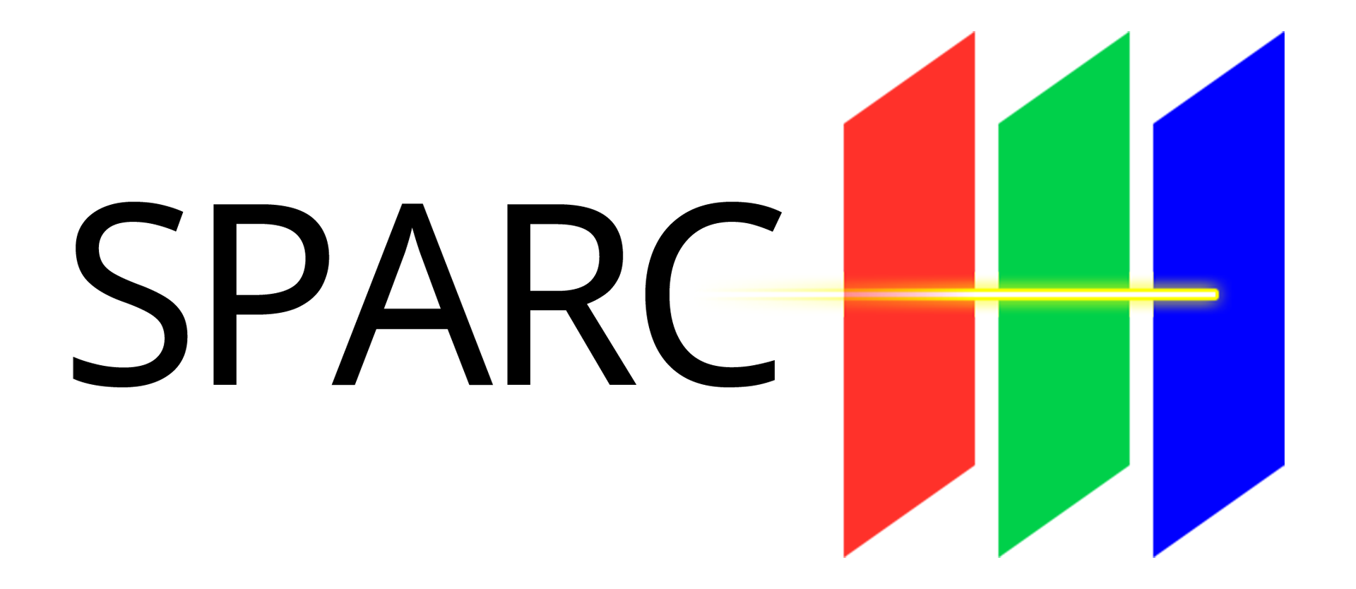
Icon Mark — Dark Background
Use the icon mark for app icons, favicons, and small-format dark-background contexts.
Download PNG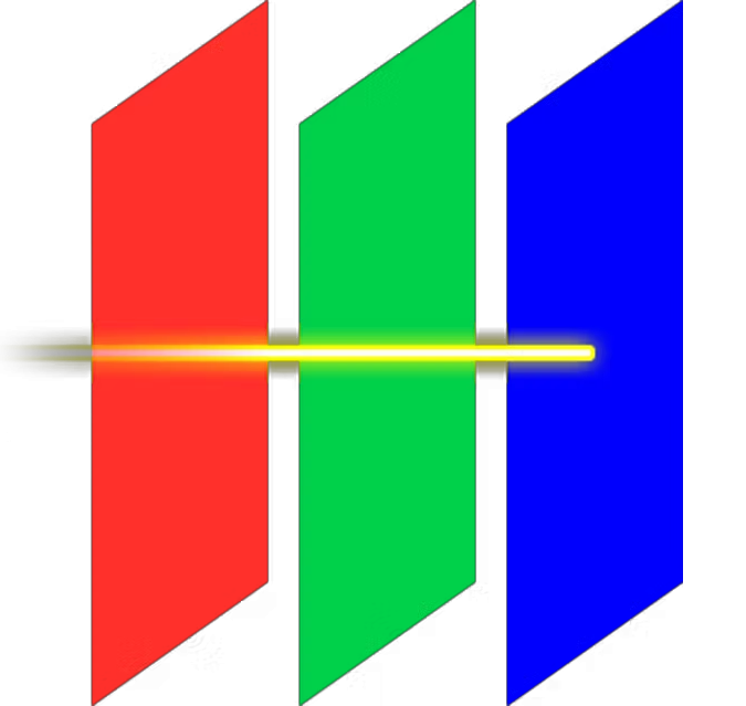
Need transparent-background SVG or vector formats? Email us and we'll send them directly.
Colour Palette
The interface palette is used across the SPARC platform and marketing site. The logo palette (below) reflects the pure RGB primaries in the icon mark.
Interface Palette
SPARC Red
Signal · Alerts · Accents
SPARC Green
Primary CTA · Success · Go
SPARC Aqua
Gradients · Secondary accents
SPARC Blue
Platform · Data · Intelligence
SPARC Black
Primary background · Dark UI
SPARC White
Light background · Reversed text
Logo Primary Colours (RGB Light)
The SPARC icon is built on pure primary light — Red, Green, and Blue panels with a yellow/white beam. These are the exact colours used in the mark itself, not the interface palette.
Red Panel
Green Panel
Blue Panel
Beam
Typography
Primary — Headings & Body
Aa
IBM Plex Sans
SPARC is the Enterprise Platform for Immersive Commercial Environments. Built by immersive technologists, for the brands that operate them.
Weights used: Regular (400), Medium (500), SemiBold (600), Bold (700)
Source: Google Fonts
View on Google Fonts →Monospace — Code & Technical Labels
Aa
JetBrains Mono
API_VERSION=v2 • 99.9% UPTIME • AES-256 • SOC_2_ALIGNED • SCREEN_COUNT=1200+
Weights used: Regular (400), Medium (500), Bold (700)
Usage: Badges, labels, stats, code snippets
View on Google Fonts →Logo Usage Guidelines
Please follow these rules when using the SPARC logo. Consistent, correct usage protects the brand and ensures we all look professional.
Do
- Use the full-colour logo on white or very light backgrounds
- Use the icon mark on black or very dark backgrounds
- Maintain the minimum clear space equal to the height of the 'S' on all sides
- Scale proportionally — never stretch or squash
- Use the provided logo files without modification
- Contact us for custom co-branded materials
Don't
- Don't recolour the logo or individual elements
- Don't place the logo on a busy photographic background without sufficient contrast
- Don't rotate, skew, or apply effects (shadows, outlines, glows)
- Don't recreate the logo in a different font or layout
- Don't use outdated versions of the logo
- Don't crop the logo to show only part of the mark
Brand Voice
Direct
Say what you mean. Short sentences. No buzzword padding. If it can't pass the Swap Test — replacing 'SPARC' with any competitor name — rewrite it.
Confident
We don't hedge. We know what the platform does and say so. Avoid 'we think', 'we believe', or 'we hope'. Show, don't soften.
Problem-first
Lead with the buyer's pain, not the product feature. Nobody cares what SPARC does until they understand what it solves.
Australian
We're proud of where we're built. Use Australian English spellings (synchronisation, not synchronization). AEST timezone. AUD pricing.
Need something not listed here?
If you need vector formats, transparent-background versions, co-branded templates, or anything else — just get in touch. We'll turn it around quickly.
Request additional assets